It is more likely than ever that your website will be ranked on Google based on its mobile version.
A Mobile-First Approach
The way Google crawls and determines how your website will rank within its search results is now more mobile-dependent than it has ever been. The company recently announced that more than 50% of all global websites shown within the search results section have been indexed based on their two-year-old mobile-indexing process.
This crawling procedure essentially focuses on the mobile version of a website and how it renders on mobile devices, as opposed to the desktop counterpart. This means that brands and marketers will want to ensure that the mobile version of their page is not only optimized accordingly, but prioritized in 2019.
Determining How You’re Indexed
Google has provided some details on how companies can review which way their site is getting crawled, and the good news is – Google seems to wants to make the transition from desktop to mobile as easy and painless as possible. Websites that are crawled via the mobile-first indexing process will typically only happen when Google has tested and determined that the website is ready, although they have mentioned that this isn’t necessarily going to always be the case. They’ve also mentioned that a mobile-friendly site doesn’t necessarily mean it’s going to get crawled this way, so it’s worth reviewing Google’s crawling data.
Site owners can confirm this by using the URL inspection tool to determine not only how their site was crawled, but when the last crawl took place.

Image Source: Google Blog
Areas of Key Focus
The blog article breaks down a couple other of negative trends they’ve seen a lot of websites encountering while going through this transition.
Firstly, the use of Google’s structured data seems to be a major component. Structured data allows your website to be highlighted and viewed in ways that are likely to make your website stand out more in the search results. Even if you’ve been using this on your desktop site, it must be used on mobile as well for it to be of any benefit. For testing purposes or more information on structured data, Google recommends reviewing this guide.
Another area that Google has placed a surprisingly large amount of attention on is image alt-texts on mobile pages. Images that don’t include alt-text, which is what is used to describes the image to the crawlers (and is also what gets to displayed to viewers if an image doesn’t load correctly), are much more difficult for the crawlers to understand, likely leading to a negative impact on your ranking.
The example below shows just how simple this change can be for webmasters and optimizers to tweak:
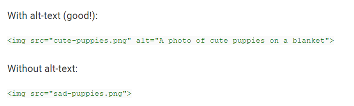
Image Source: Google Blog
Go Mobile or Go Home
As mentioned above, marketers with a focus on moving organic ranking higher up on the search engine results will want to ensure they’re syncing up with their site owners accordingly to review some of the elements listed above.
Fortunately, if your website is already utilizing a responsive design, the structured data and image alt-texts shouldn’t be an issue and you should be well on your way to a healthy crawl. On the flip site, if you still use a separate desktop version and mobile version website, this could impact you.
While Google suggests that it wants to give site owners the time they need to get up to speed on these changes, we don’t recommend sitting on this for too long. With over half of all sites now having their ranking determined in this fashion, it won’t be long before yours, too, goes through the switch.